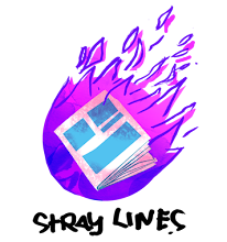
SAVAGE TOWN, the graphic novel I recently worked on, quite rightly received a nomination for best Irish Comic Cover of 2017. Of all the many elements of the book and all the work involved in the book's production, the cover is the most representative of the TEAMWORK that helped make the book more than the sum of its parts.
What might surprise you is that I wasn't mad about the cover image when I first saw it. It took a while for it to sink in and make its brilliance obvious. In a way this realisation was like when you listened to music in the album format back in the day. It could take a while for you to work out which were your favourite songs and they quite often weren't the songs that stood out on first or second listen.
Here's a little bit more about how the cover got put together.
When it comes to getting eyeballs on and inside a book, nothing is as important as the cover. It has to stand out as well on a shelf as it does as a tiny thumbnail on a web page. From the email correspondence I can see we were already looking at the cover of the graphic novel before the art on chapter one had been completed. This would have been before chapters two to five had even been written let alone drawn. You can't judge a book by its cover but what if the book inside doesn't exist yet?
The seed of the cover began with the original pitch for the book. The book's writer
Declan Shalvey had a strong vision as to what the book should be which I had boiled down to:
Authentically Irish in setting and outlook, a strong sense of
Character and a dash of dark
Humour. Here's a selection of thumbnails from that first run at a pitch cover with an early version of the logo I had cobbled together:
Number three got a laugh out loud from Declan but was probably a bit too humorous for our purposes. At Declan's suggestion we ended up using a hybrid of four and five. Check out Jordie Bellaire's excellent muted colours on the finished layout:
Throughout the process of the cover (and indeed every other visual part of the book) Declan effectively acted as an Art Director and though his hand isn't on the cover, his welcome sensibility is all over it.
I was relishing the chance to have another go at the cover for the graphic novel. My default mode for covers is to try to get something narratively interesting in there - to suggest more happening before or after the image presented. With that in mind I knocked out what I thought was a decent first batch of thumbnails:
Declan wasn't so sure however: "Honestly, I think the original batch of covers [from the pitch] are far more striking than the recent bunch. They're all grand, don't get me wrong, but I think they either make the story seem a lot more violent than it really is, or they're situational, which doesn't really 'pop' as a cover."
Back to the drawing board. This time I tried to think a bit more 'design-ey', focusing on shape, positioning and white space - trying to get a better image rather than communicating story.
I even went so far as throwing a bit of colour onto some of the options on the second page - colour being an essential part of any effective design.
These went over much better with Declan. Of the second page options numbers two, four and five were really hitting the spot. The silhouetting of the head on two is what makes it and if I remember rightly that was because I'd made a hames of the face and blacked it in as an afterthought.
Number four, the car in the rain, actually ended up as a back cover on the Image+ magazine as part of the Savage Town feature. Here's Jordie's scintillating colour job on that one:
Ironically I didn't like my drawing of Jimmy's face in the finished linework on this one either - Jordie had the good grace to drop the face back a bit in the colour version. It annoyed me so much I ended up doing a paste-over fix. Unfortunately I didn't get it finished in time to be recoloured. Here's the fixed linework:
At this point Declan pushed the thumbs out to the wider team. By this time the designer Emma Price had been working on refining the logo for a while and it was looking really sharp.
Emma was also keen on the second page of the second round of thumbnails even going as far as dropping in the logo on some of the rough layouts to see how they would work.
Here's where the magic really starts to happen in my opinion. The punchy logo and its colour treatment is a fundamental element of why the cover works so well. Exploring the logo layout options at this stage in the cover development really helped to make everything gel in the final piece. So many covers have the title slapped on top - on this one the title is integral.
The consensus was for the first option here with the larger slightly cropped title.
The first step was to do a mid size rough (about 50% of final printed artwork size) to get a bit more of a feel for the pose.
This looked a bit wooden and the folds on the tracksuit weren't working for me. When in doubt reference it out:
That said, and though it's helpful, I never really stick to reference images too rigidly. You can end up with something that looks like a traced photo. In that case why didn't you just use a photo instead of drawing in the first place?
I can see a lot of blue pencil around the head on the original artwork - I was struggling with the position of the silhouetted head and face. At some stage I decided it would be easier just to draw them in and black out after scanning.
We were able to use the reverse i.e. just the head, to good effect on the inside front facing page:
No marks for pointing out the position of the publisher logo here.
The final piece of artwork was cropped tighter into the elbows to give the figure a more imposing presence..
I had also provided a guide layer for the tracksuit pattern. Jordie (and Declan over her shoulder) went another direction however. Instead they overlaid a flatter leopard spot pattern onto the tracksuit as well as offsetting the yellow bars and base green colour to give the image the feel of a vivid screenprint. A touch of genius was then to drop the zebra stripes into the silhouetted head area. Emma the designer offset the title and credits similarly to complete the look:
Here's the framed cover linework from the
recent show in the Ormston House Gallery in Limerick City:
Only one person can own the framed picture but anyone can own what is really the final artwork: that is the printed cover with all the contributions and teamwork that make it truly SAVAGE.